Promotions
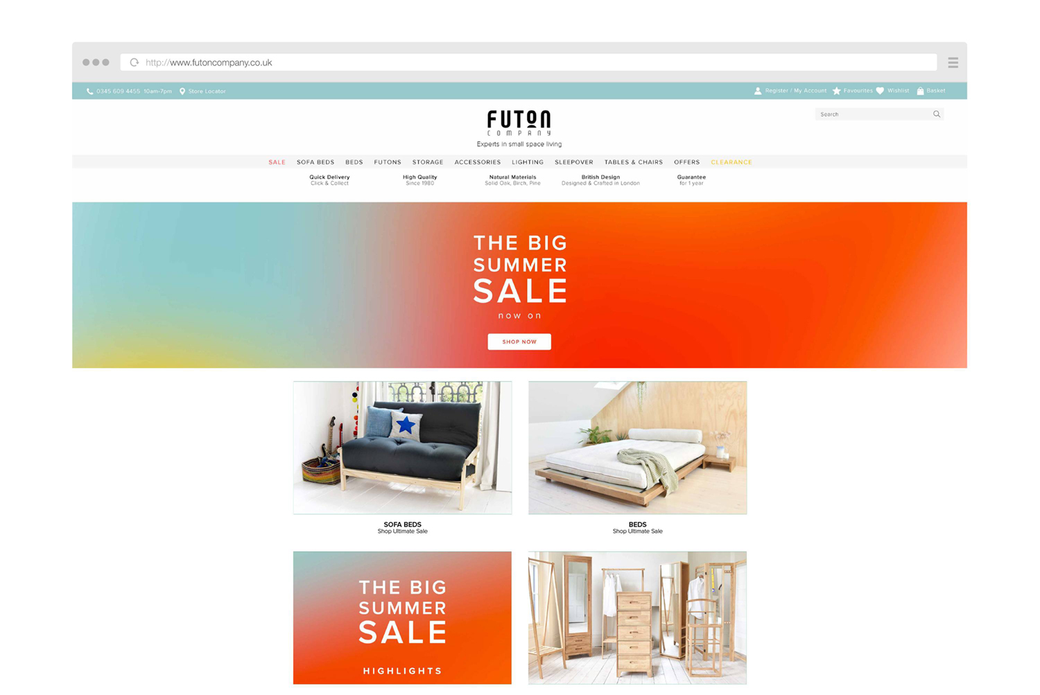
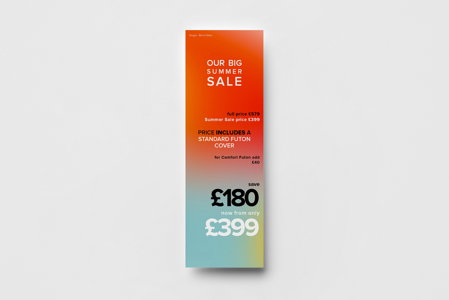
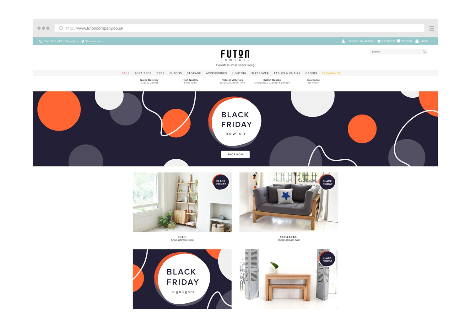
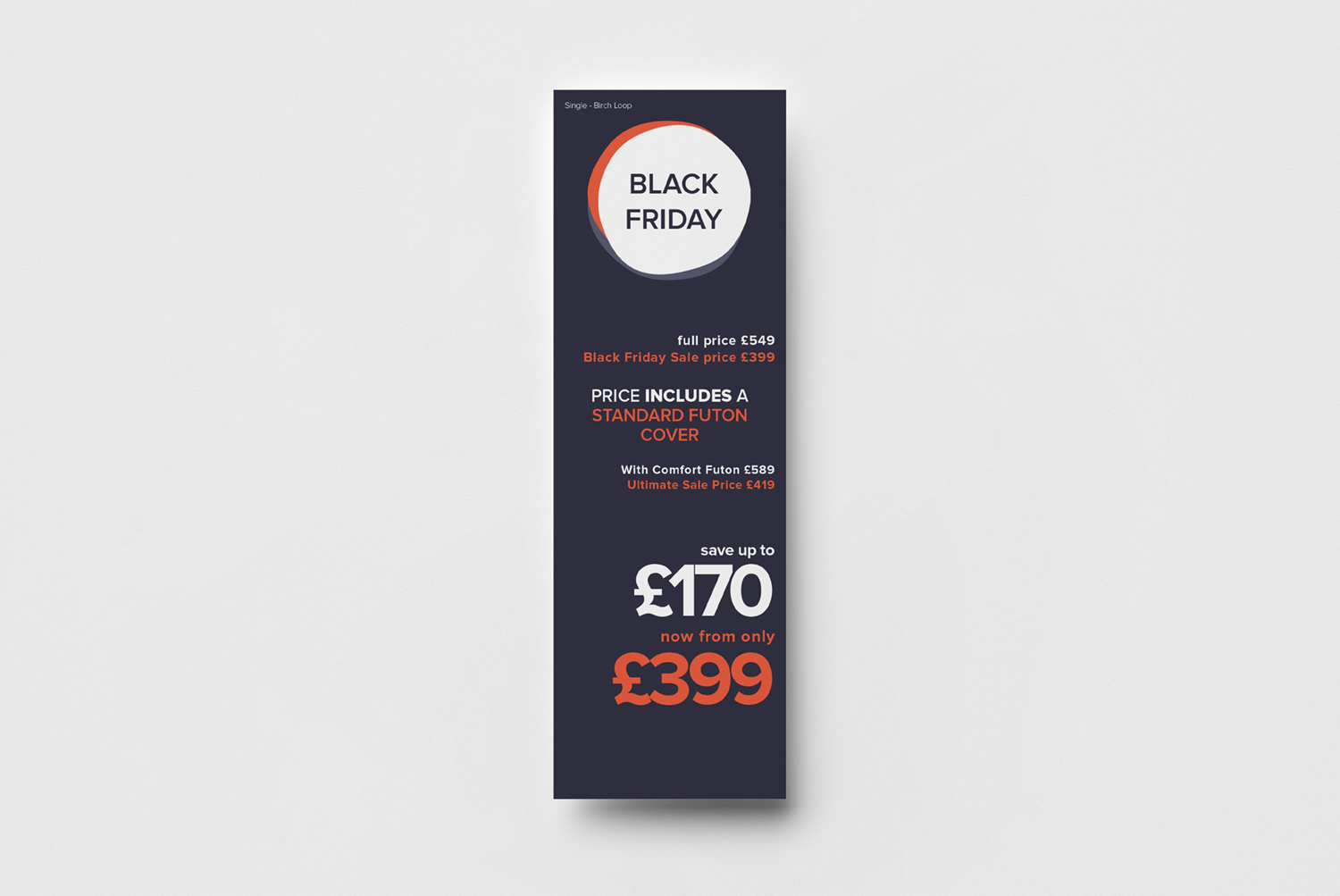
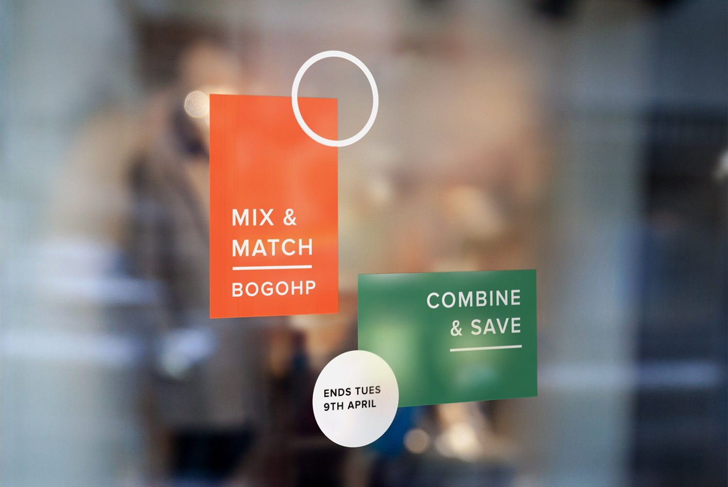
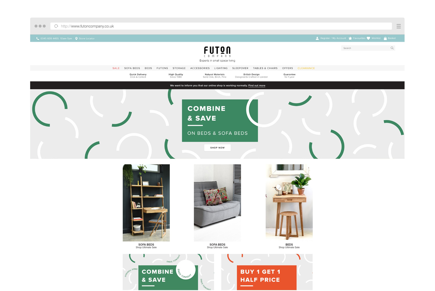
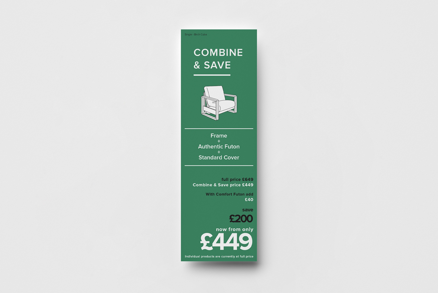
Futon Company promotions change every two to four weeks. I am responsible for designing decals, price tickets, web assets and newsletters. My restrictions are decal dimensions as one size must fit all stores and the use of bold colours as we mainly use inside decals. The text on web assets must always be quite big and contained in the centre of the page to be visible on all devices.
Black Friday
Black Friday is a very important sale for the company. I kept a dark tone but it was a requirement from the company that I mixed with a more punchy colour to still attract the eyes.

Combine & Save
The company sometimes run two promotions simultaneously. The challenge was to make them work together while being contrasting enough to convey a clear message.
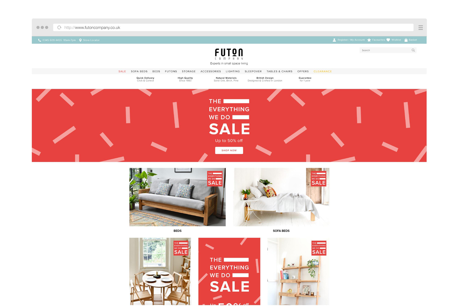
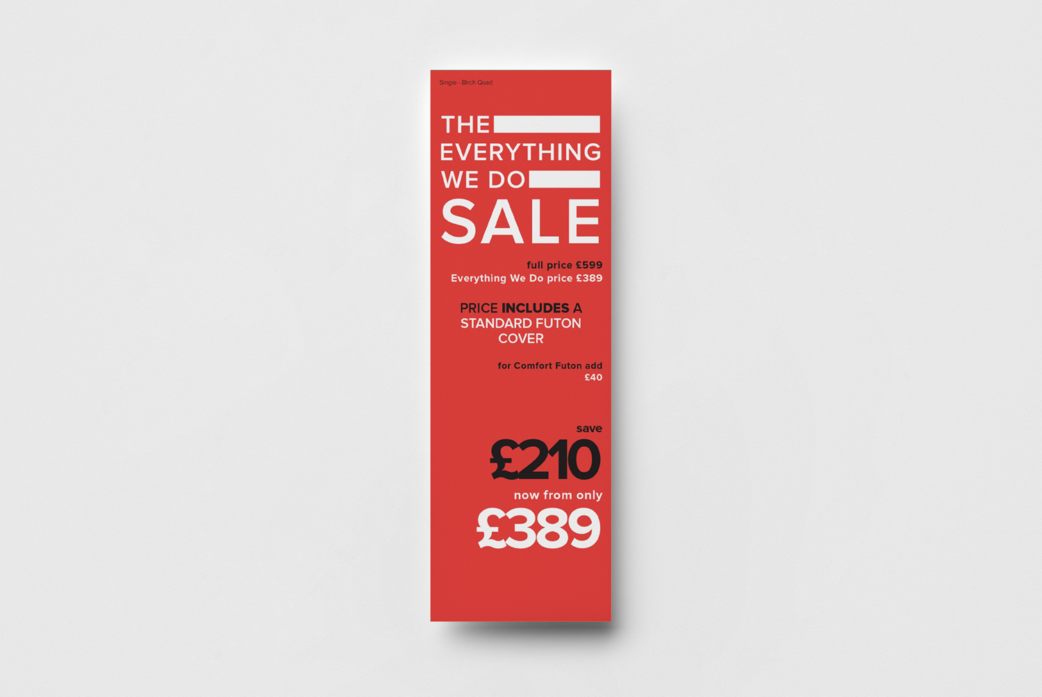
Everything We Do
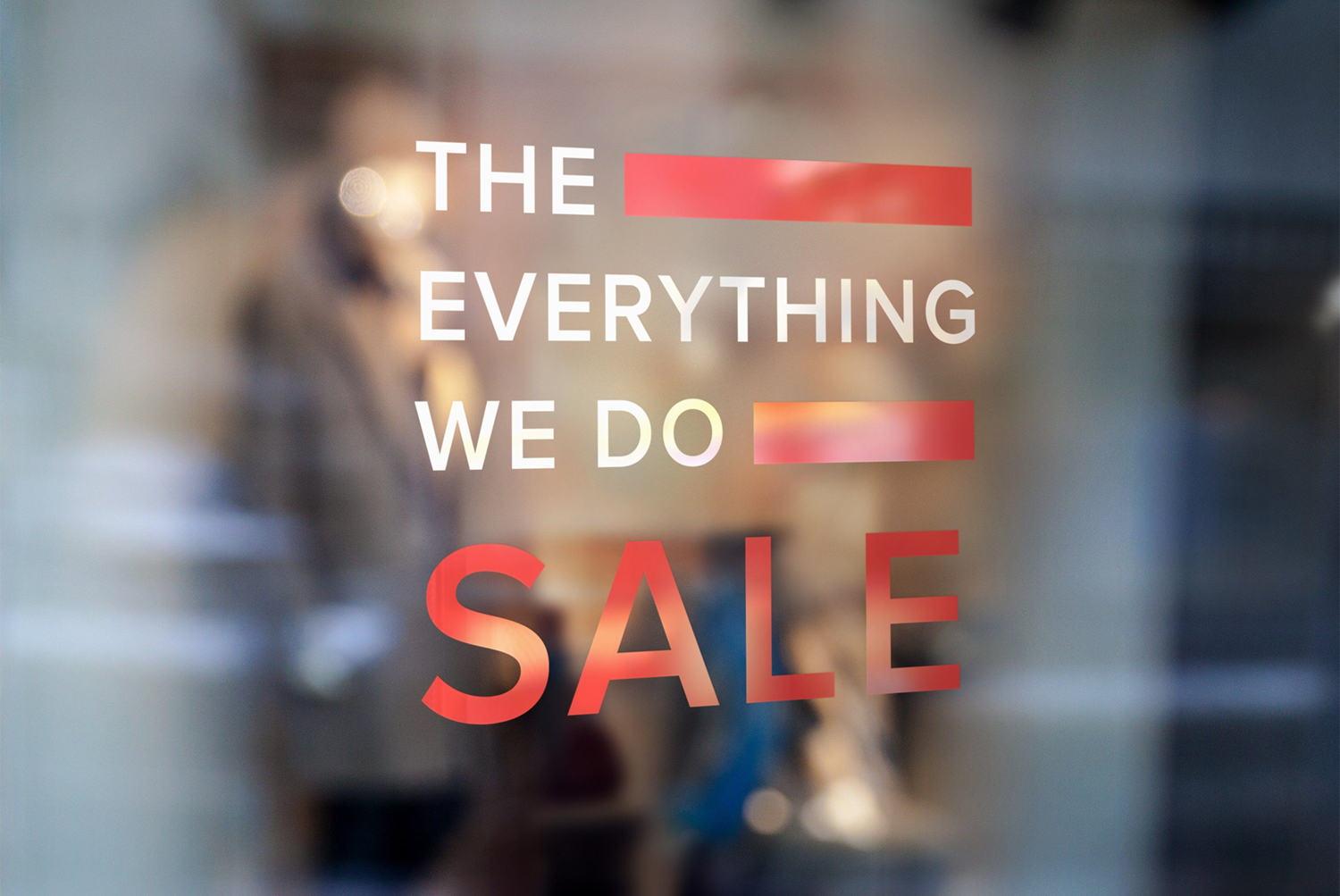
The challenge here was to work with a wordy promotional name on a restricted layout. I used the blank space as a graphic component to give structure and hierarchy to the message.
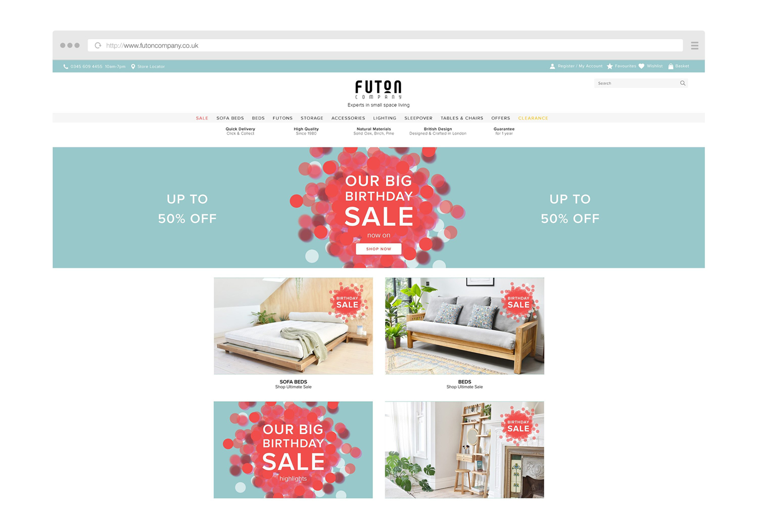
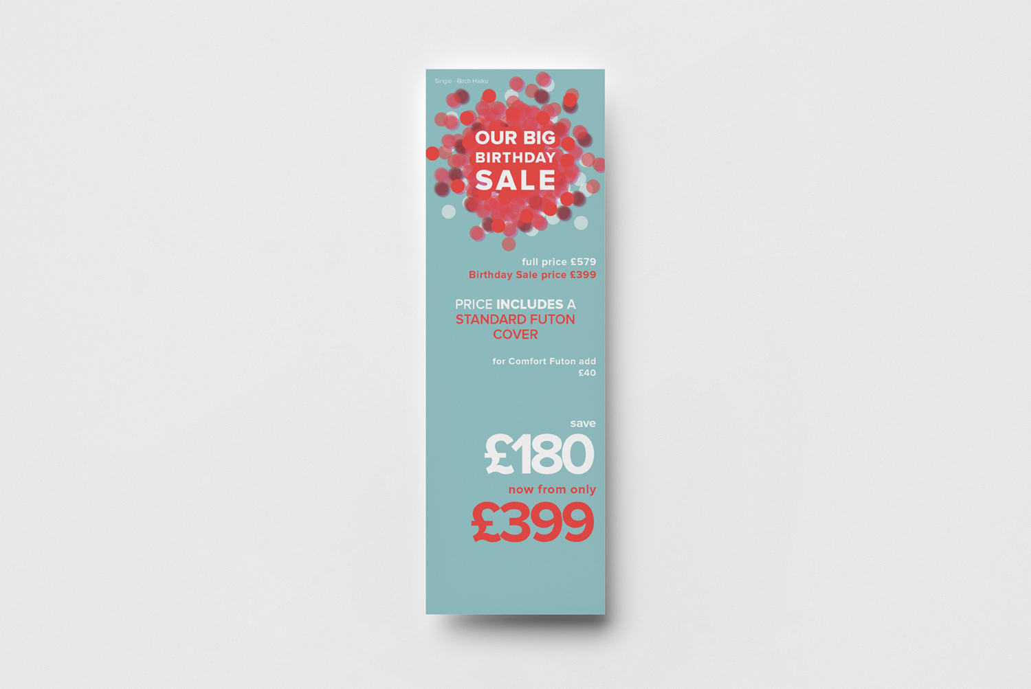
Birthday Sale
For their birthday, I came up with a festive yet abstract theme. The difficulty was to create a bokeh effect on decals playing with layers and transparency.

Summer Sale
For Summer Sale, we needed a different and punchy promotion. I tried something new with this long decal block.
